
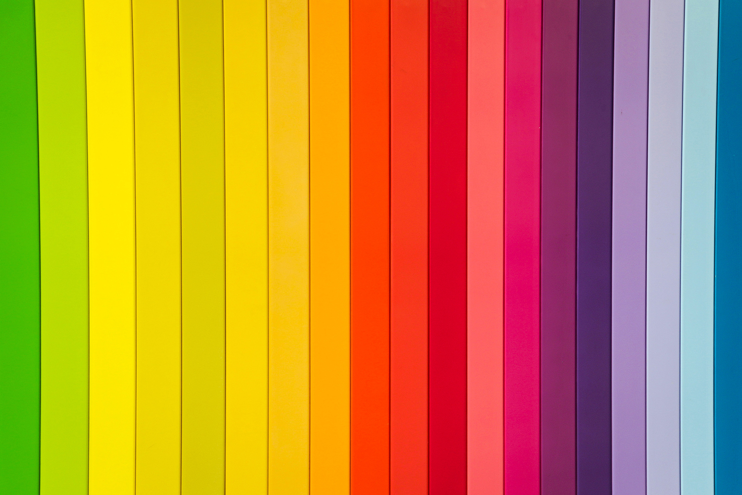
Color surrounds us. It can make us feel happy, sad, angry, calm, strong, and more. You see, color evokes strong emotions, messages, and adds light into everything around you.
Color also plays an important role when it comes to logos. It helps to convey to your audience who your company is and what you stand for. If you choose the wrong colors for your logo, you can end up driving potential customers away. So before you go choosing colors you personally like, think about your brand personality.
Brand personality is comprised of 6 things:
- Gender: Is your brand more masculine or feminine?
- Tone: Is your brand more playful or serious?
- Value: Is your brand more luxurious or affordable?
- Time: Is you brand more modern or classic?
- Age: Is your brand more youthful or mature?
- Energy: Is your brand more loud or subdued?
How your answers fall on the spectrums determines your brand personality. You can then use that to determine the right colors for your logo.
Red
Represents: Love Anger, Hunger, Health, Excitement
Red is a strong and energetic color. It is often used in logos representing, food, beauty, and entertainment. Some notable brands that use red as their main logo color are Coca-Cola, Red Bull, YouTube etc.
Orange
Represents: Vibrant, Playful, Happy, Artistic, Energetic
Orange is another color that is popular among food, art, and even the sports industry. It is a very energetic color without being too overpowering like red can be. Orange suggests a sense of playfulness and youth, so it is very popular amongst kids’ products and food like Nickelodeon and Fanta.
Yellow
Represents: Happiness, Warmth, Innovation, Caution, Youth
Yellow is a warm color that makes you feel happy, warmth, and even relaxed to a point. It tends to be used as a supporting color in logos as when it is used alone, it can be overpowering. Yellow is most often used in the automotive and food industries.
Green
Represents: Harmony, Nature, Health, Renewal, Growth
Green is a color that represents peace and growth and often tied to nature. Many brands that use this color as their main logo color are eco-friendly although there are some that use it that are in the food industry too as a sense to depict freshness. Some sample brands that utilize green in their logo are BP, Starbucks, and Animal Planet.
Blue
Represents: Professional, Serene, Trust, Loyalty, Strength
Blue is one of those colors that just makes you feel good. It conveys a sense of tranquility and safety. In a logo, blue also represents the idea of professionalism and that this company knows what they’re doing. It is used by a wide range of businesses such as software and finance, to even health and wellness.
Purple
Represents: Royalty, Luxury, Imagination, Mystery, Educational
Purple is all about the regal things. It portrays images of divinity and mysticism. Brands that choose to include purple in their logo tend to be of religious nature or of high-end products or creative outlets.
Pink
Represents: Feminine, Nuture, Compassion, Love, Hope
Pink is a combo of Red and White. It is a calming color that reaffirms unconditional love and nurturing kindness. It is also used as a sign of good health which is why it is often found used in the female market.
Brown
Represents: Earthy, Durable, Friendly, Homely, Natural
Brown is a color you may not think to include in your brand's identity as it is often seen as a dull color. However, brown is an excellent choice when you want to portray your company as down to earth or natural. This color is often used in masculine products and outdoor companies that give off a "rugged" appearance.
Black
Represents: Authority, Mystery, Bold, Elegance, Modern
Black is the absence of all colors but that doesn’t mean you shouldn’t use it in logos. Black can portray a brand as luxurious and edgy but also timeless. Any industry can utilize this color in their logo but it is more commonly involved in automotive and fashion industries.
White
Represents: Purity, Peace, Spiritual, Clean, Truthful
White is the combination of all colors. It might not seem like there is much to offer with white but you can actually do a lot. If you are trying to achieve a negative space logo, utilize white to make it pop.
Colors play a key role in giving your logo a chance. Take the time to figure out what your brand’s personality is and then choose your colors based on that. You will give your logo the best chance at representing the essence of your company to your target audience.