
Have you ever heard the saying “Don’t judge a book by its cover?” Those are some good words to live by. However, if you have a website for your business, you need to realize that this is going to happen. In fact, it takes the average user 15 seconds or less to make the decision to stay on your website or to leave. So what can you do to make their experience the best possible within those 15 seconds? Well one of the most important things to do, is to make sure your website is responsive.
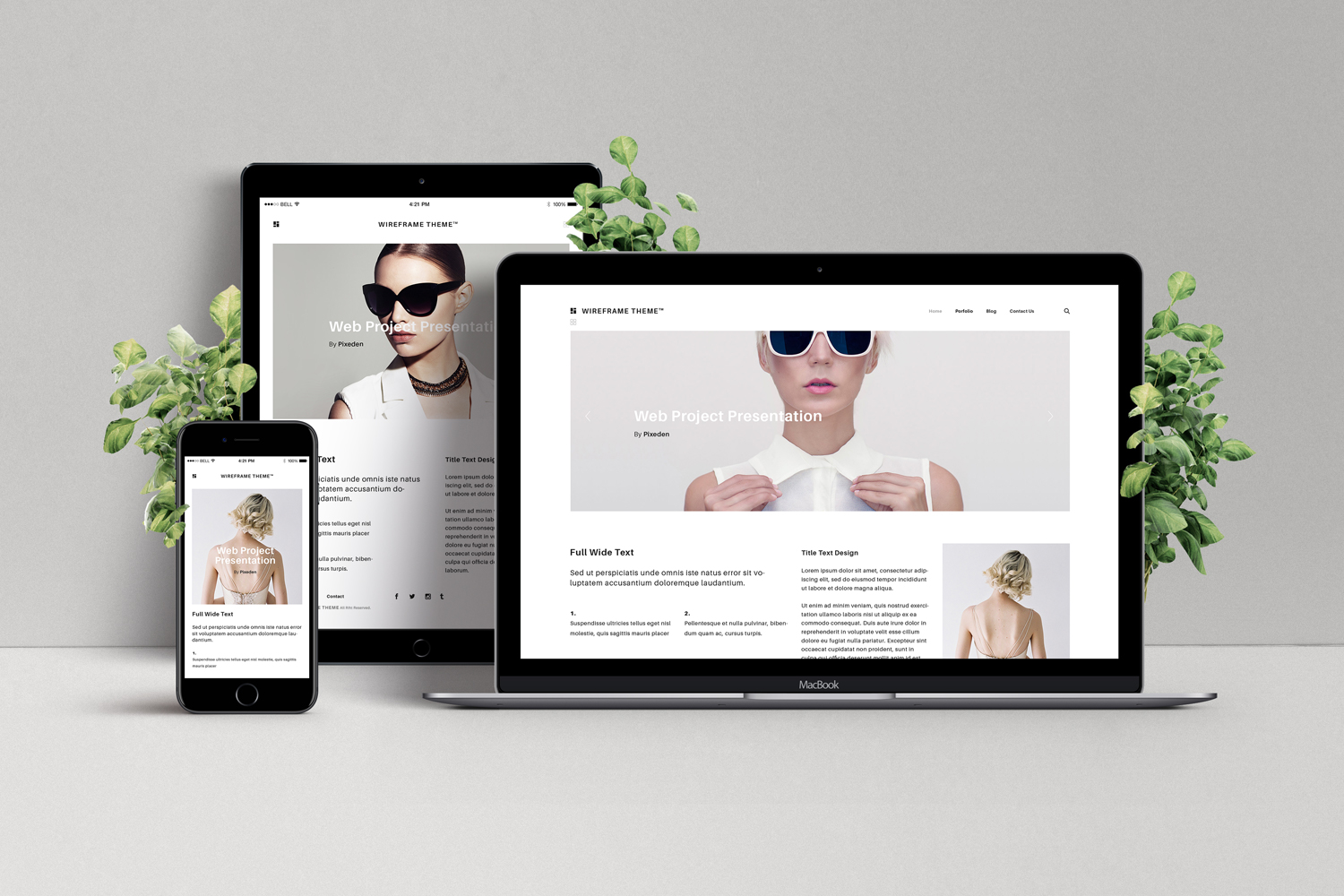
What is a Responsive Website?
A responsive website is a design that is capable of adapting to several screen sizes, whether the user is on their phone, tablet, laptop, or computer, or something bigger. A website that automatically adjusts for the user will result in a better experience for them and provide a number of benefits for you.
What are the Benefits of a Responsive Website?
#1 – Improved User Experience
Having a responsive website will generally lead to better user experiences. This can be determined by how long a user spends on your site. If your site is hard to navigate or users have to zoom in and scroll around for what they are looking for, they will leave. Make your website as accessible as possible by optimizing it for mobile devices This will make navigating your website a breeze and overall provide a better user experience sure to keep them coming back.
#2 – An Increase in Mobile Traffic
More than half of traffic on the internet comes from mobile devices. With that being said, it is crucial for your business to have a responsive website. Consumers on the go don’t have time to sit down at a computer and look up your site. They need to do that on their phones. If your website is responsive, then users can find the information they need which in turn will result in a higher conversion of sales in the same day.
#3 – Faster Website Development
Up until 2020, it was common practice for a business to have a separate mobile version of their website. Whenever a smaller screen size was detected, the user would end up seeing the site that was specifically designed for that device. Having to develop both a standard site and a mobile site takes more time than developing a responsive website. Save time and money by having your developer create a website that functions and looks great no matter what device the end user is on.
#4 – Easier Maintenance
This point is tied to the point above. When you have two versions of your website, your development team has to divide their time between both and make sure the websites are consistent with their content. A responsive website requires less maintenance time and leaves more time for your team to work on content development and marketing strategies.
#5 – No Duplicate Content Penalty
Another downfall to having two versions of the same website is duplicated content. Search engines deploy crawlers on websites to basically read all your content so when a user searches for something they can provide the best results. When you have two versions of the same website and they have the same content, search engines cannot figure out which one is more relevant. This will cause both of their search rankings to drop. If you are set on having both versions, then you are going to need to develop separate SEO strategies to keep their rankings up. That is going to be quite the money and time investment. Save yourself the headache and build a site that adapts to all sizes.
#6 – Simpler Website Analytics
Having a responsive website is a blessing when it comes to web analytics. Analytics will let you evaluate data about your website visitors. You can see if what type of device they are using to access your website, what time they accessed it, what pages they viewed, and so much more. It’s a great way to see what is working for your business and what you can do to improve your business.
#7 – Better Website Loading Times
Websites that are designed to be responsive tend to load faster across all devices, especially on tablets and cell phones. Design and development has come a long way where we can optimize images and create fluid grid layouts which decreases page load time. The lower the page load time, the better the odds of a user to stick around on your site. Research shows that if your website takes longer than 3 seconds to load, 53% of users will abandon the site.
#8 – Lower Bounce Rates
A bounce rate denotes the percentage of website visitors who leave your site after only viewing one page. As we mentioned before, responsive websites improve the odds of a user staying on your site longer and look around which in turn lowers your bounce rate.
#9 Higher Conversion Rates
The more time a user spends looking around your website are a good sign of their experience and helps you to establish trust. This in turn will lead to higher conversion rates, whether that’s signing up or a newsletter, giving you a call, or even purchasing your products.
#10 – Better SEO
As we mentioned earlier in this article, another benefit to responsive web design, is your ranking in search engines. If your website isn’t responsive and it doesn’t pass the mobile-friendly test, it will result in your website being placed lower on the results page as opposed to a responsive design.
Overall, there are numerous benefits to having a responsive design for your website. If your website isn’t responsive, don’t worry. A great first step is working with a designer to come up with a redesign to push your website to the top. Once you are set and ready to commit, get that website developed and you will be on your way to boosting your business online.